Start with the key numbers
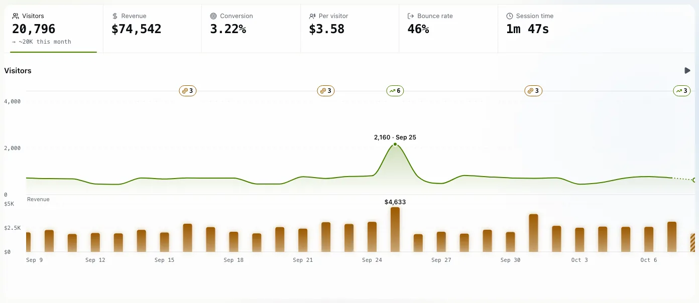
Open Data. The strip along the top holds six numbers for the period you chose: Visitors, Revenue, Conversion, Per visitor, Bounce rate and Session time. Revenue, conversion and per visitor appear once you have connected a payment provider (see track revenue).
Click a number and the chart below draws that one. Hover the chart to read a single day. The small badges along the top of the chart are moments worth a look: a spike, a milestone, a day with many sales. Click one to see the story behind it.
Choose a period
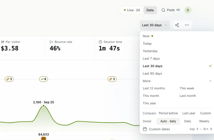
The button next to the share icon names the period, Last 30 days by default. Click it for the quick choices: Now, Today, Yesterday, Last 7 days, Last 30 days and Last 90 days. More adds Last 12 months, This week, This month, Last month and This year, and Custom dates takes any two days.
Under Detail you pick how the chart is cut: Auto, Daily or Weekly.
Compare it with an earlier one
In the same popover, Compare offers Period before, Last year and Custom. Every key number then shows its change next to it, for example "8.8% up vs the 30 days before".
See who came
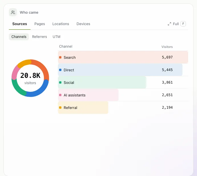
The Who came card lists your visitors four ways, one tab each:
- Sources: where they came from. Inside it, Channels groups them (Search, Direct, Social, AI assistants, Referral and so on), Referrers names the sites, and UTM shows your campaign tags.
- Pages: which pages they saw.
- Locations: their countries.
- Devices: desktop, mobile or tablet, with Browsers and OS a click away.
Click a row and the whole dashboard narrows to those visitors: the numbers, the chart and every other card. The filter appears as a chip, for example "Channel is Search". Filter in the toolbar does the same from a menu: Channel, Referrer, Campaign, Entry page, Page, Country, Device, Browser, OS or Goal.
Tip. Full (or the key F) opens the Full view, with more detail than the first screen.
The newsletter
Notes on measuring what matters.
Occasional emails from Albi: new posts, one chart worth reading, what changed in trckable.
We send one email to confirm your address, and nothing more until you confirm. Every newsletter has a link to leave. What we keep, and who sends it: privacy.